

Issue #: 200
Published: March / May 2025
- Price per issue - digital : 6.50€Digital magazine
- Price per issue - print : 9.50€Print magazine
- Access to Multihulls World digital archives Digital archives
Designing a collector’s edition magazine cover... not so easy! Find out how we set about achieving this in two stages, by following the step-by-step construction of the visuals for Multicoques Mag #200 and Multihulls World #200.
Published 31/01/2025
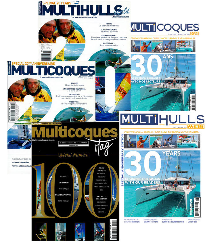
Subscribers OnlyWe didn’t really start from scratch as Multihulls World had already celebrated its 20th anniversary, its 30th, and above all its 100th edition on the covers. But that one was reserved for the French edition: Multihulls World n°71 therefore saw a “traditional” cover. When the time came for Multicoques Mag #200, we opted for a general formula relatively close to that of #100 but sharing it between the two magazines. The covers, very similar to that one, adopted two distinct backgrounds: gold for the French version and silver for the English version. For this 200th edition of Multihulls World, we have logically remained in the spirit of our Multicoques Mag #200 - but this time, the party is reserved for the English-language version...
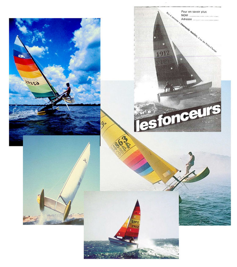
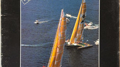
For issues as symbolic as Multihulls World n°200 and Multicoques Mag, we felt we couldn’t really dedicate our cover to a modern cruising multihull - and therefore to a specific builder. So, there were two possibilities: multiple images and therefore multiply the number models and the atmospheres or get down to some graphic design work. Five years ago, we opted for the second option, while trying to avoid all the typical opportunities common to this exercise – birthday candles, patchwork of old covers, etc. Our initial inspiration was this ad for Hobie Cat, with a Hobie 18 jumping off a wave - remember the famous video. The Hobie is where all of us began – an Optimist or a Sunfish, and then a Hobie! When we asked the company, they offered us a few pictures from their photo library, and we’ve we stayed with those of the time. Our favorite, the view of the Hobie 14 seen from ahead, was used as the cover picture.
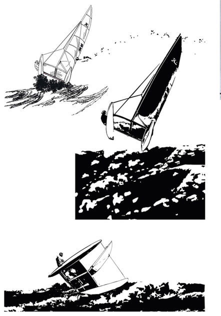
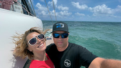
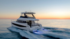
Once the image was chosen, we asked Cyril Richard, a friend of the editorial team - an outstanding helmsman but also a graphic designer - to draw and vectorize it so that we could work on it at our leisure. There were three modifications compared to the original: the helmsman became more visible, the rib disappeared, and “material” was added so that it was possible to frame the catamaran wherever we wanted on the cover. In the end, Cyril produced two drawings: the one on the photo chosen and a similar composition. Each drawing was proposed at two levels of definition - we opted for the first, in a less detailed version. Of course, the cover you see today, while close to that of MM #200 and MW #171, has been reworked, and we’ve decided to add a contemporary touch with a photo of our long-standing partner, Lagoon, which has always featured in the magazine.
During ...


What readers think
Post a comment
No comments to show.